Wildlife Conservation Society
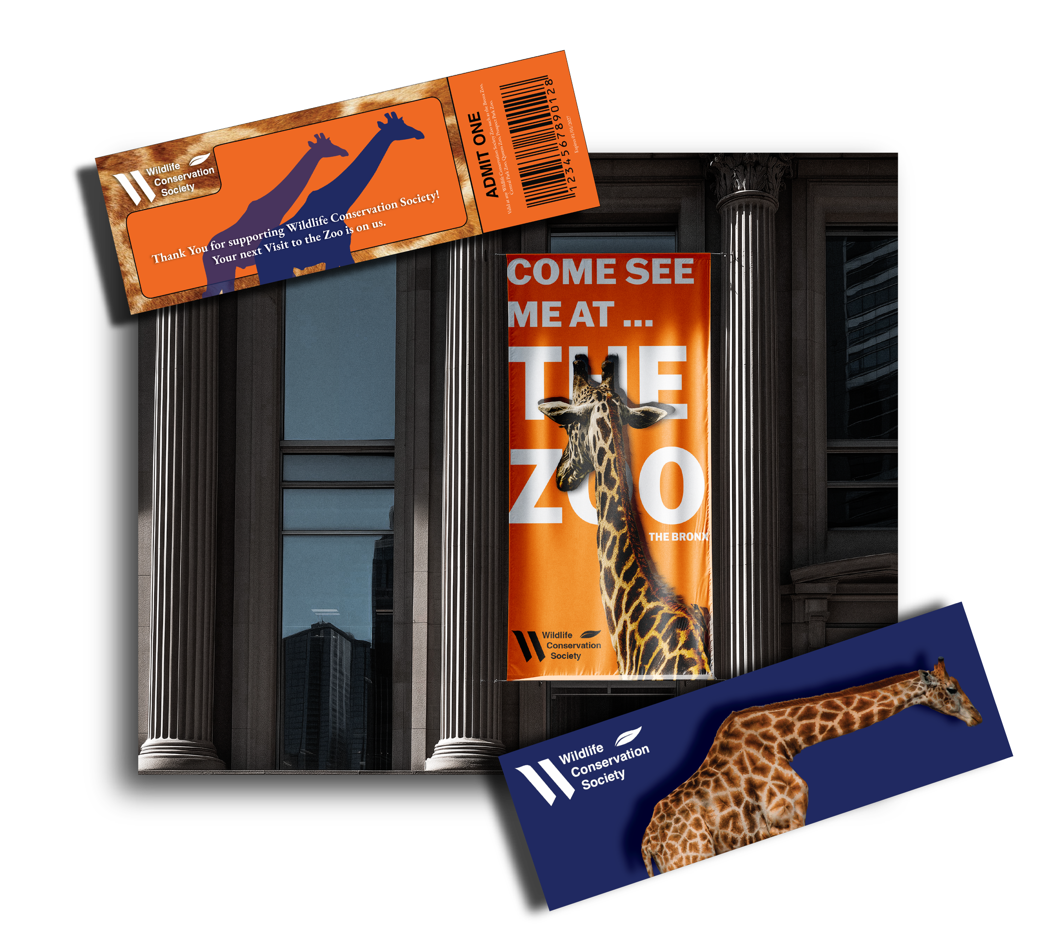
The Redesign of Wildlife Conservation Society’s Logo and visual identity
My Role: Brand Researcher, Brand Strategist, Visual Identity Designer - CASE STUDY
Project Dates : 01/26/26 - 04/12/26
Project Overview
A rebrand rooted in the idea that inspiring a generation to care deeply is more powerful than convincing them the world is ending.
Objective:
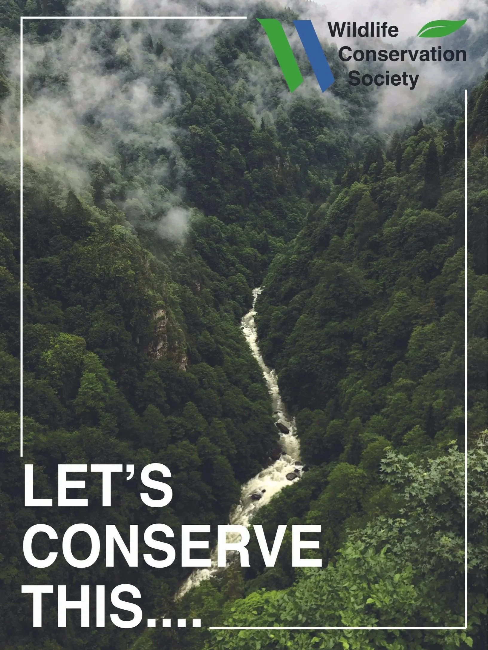
To reposition Wildlife Conservation Society for Gen Z supporters by shifting from crisis-driven messaging to impact-driven storytelling that inspires hope and long-term support.
Why? :
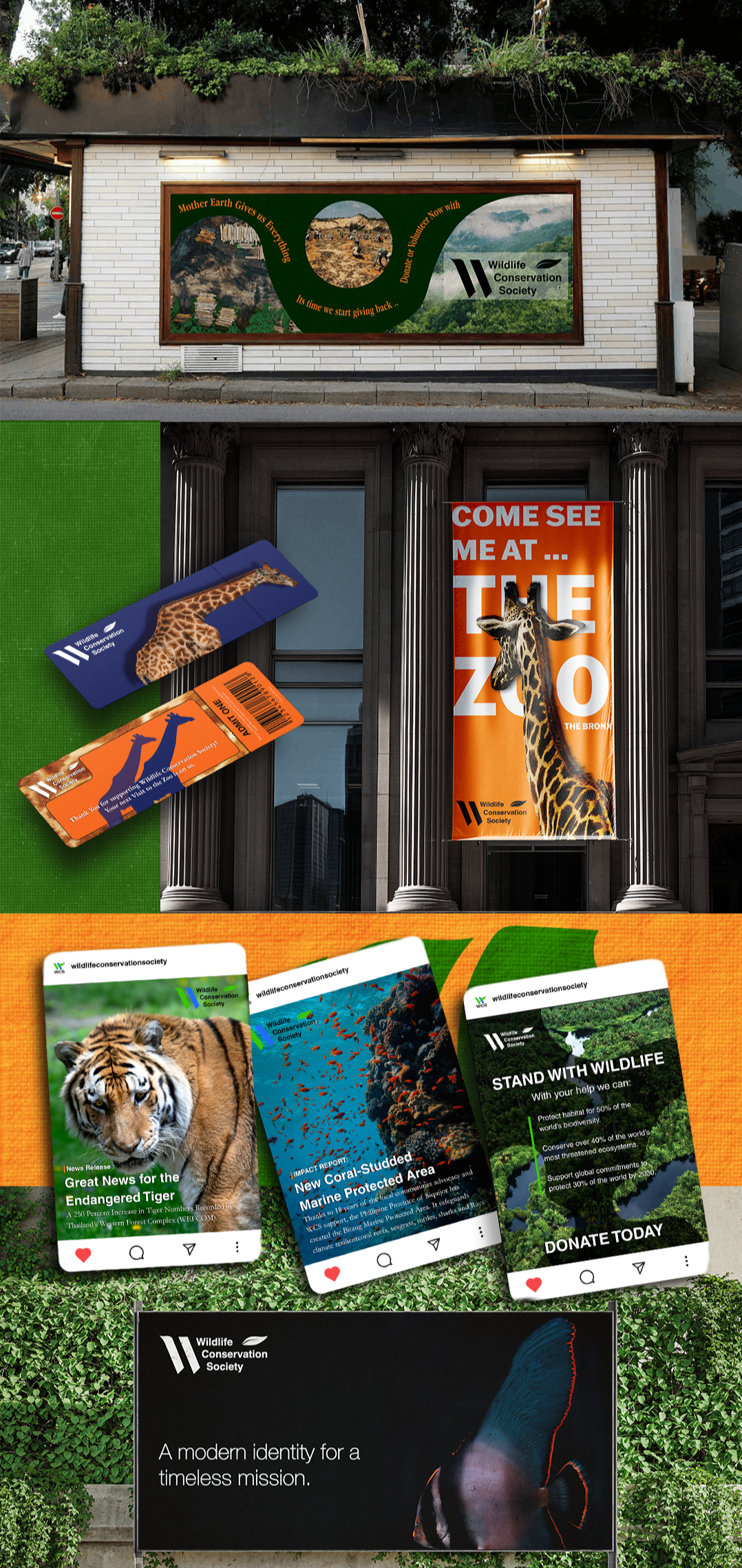
Wildlife Conservation Society appealing themselves more to Gen Z opens doors beyond just asking for donations. I do that by having a more impact-focused brand that inspires hope and helps reduce climate anxiety. This approach gives WSC better content for social media that Gen Z will actually engage with and share. We also want to Increase brand recognition and to build a loyal Gen Z supporter base . We can do so by having more story telling based marketing and visual identity , along with creating merchandise that a younger audience would want to purchase.
Research
Wildlife Conservation Society already has the mission and the legacy. The research just helped reveal the gap between who they're reaching and who they could be inspiring.
Goal :
To understand who Wildlife Conservation Society already speaks to, who they want to speak to, and what stands between those two audiences and deeper engagement with the brand.
Research Methods :
To build an honest picture of WCS's audience, I conducted Brand Research to understand their mission, values and current positioning, then used Secondary Research including Pew Research studies, donor data and the WCS 2025 Impact Report to ground my user personas in real data rather than assumptions. This gave me two distinct personas: the typical current supporter and the emerging Gen Z audience the rebrand needed to reach.
Research Findings on the Organization : Wildlife Conservation Society
-
Wildlife Conservation Society saves endangered species and critical habitats worldwide through science-based action, community partnerships, and inspiring millions to value and protect nature for future generations.
-
Protect and save wildlife through science .
To Educate and Inspire people to value nature.
Conserve the Earth's biodiversity
Collaborate with indigenous people and local communities
Promote sustainability
-
World Wide Fund for Nature
Conservation International
Smithsonian National Zoo & Conservation Biology Institute
Wildlife Conservation Network
Personas
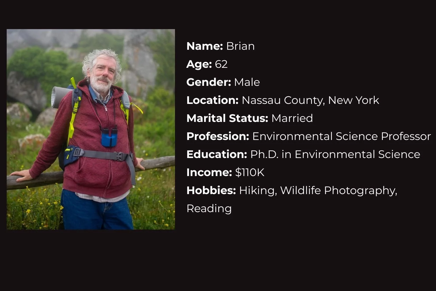
Their current supporter is loyal, established and deeply motivated, typically a higher income Baby Boomer or Gen X donor.
Gen Z, a generation that is deeply climate anxious and values driven but financially stretched, is ready to support the mission in a different way if the brand meets them where they are.
Current Customer Base:
-
He loves this organization because it gives him a sense of hope and purpose, helping him feel that his contributions make a meaningful difference for future generations. As an academic, he deeply values that all of WCS’s actions are backed by science and research, especially in a time when public trust in scientists is rising in the U.S. Also as an educator , he admires their commitment to working closely with local communities and Indigenous people . He understands the value of diverse perspectives in conservation, especially indigenous knowledge.
-
Brian has a lot of expectations and desires for this organization . Not only is the Wildlife Conservation Society aligned with his passion, but its impact feels deeply personal to him. As a grandfather , he expects that WCS takes actions that have long-term impacts to help insure a healthy planet for future generations. He also hopes they continue to expand their efforts to inspire more people to value nature.
-
He struggles with the weight of his deep knowledge of environmental issues and the role his generation played in causing damage. As an older man and grandfather , he feels a strong sense of responsibility and guilt for what's been done so far. Even though he donates, for him it sometimes feels like it's not enough. Even though the organization makes progress, it’s hard for him to fully appreciate it when he’s constantly aware of the ongoing harm to the planet.
Targeted Customer Base :

-
She loves Wildlife Conservation Society because of its real, impactful actions to protect the planet from ongoing damage. As a young person anxious about the future and frustrated by the lack of action from those in power, the organization's work gives her hope for a better future.
-
Alice expects Wildlife Conservation Society to use sustainable practices, advocate for renewable energy , be vocal on climate issues and work with local communities. She also expects that they have a strong social media presence to share clear, engaging information widely, especially to the youth. As a social media marketer, she understands how vital an online presence is for building a loyal , active community.
-
Her main challenge is deciding whether to donate regularly . With inflation and the rising cost of essentials like gas and groceries , her already tight budget makes it difficult for her to justify spending extra money on charity instead of saving for a rainy day or paying off student debt. This frustrates her because she wants to advocate for the organization to her friends but knows that many of them, like herself , can’t afford to give away the little money they have right now.
LOGO Ideation
Sketches
Tweaking Details


Final Logo

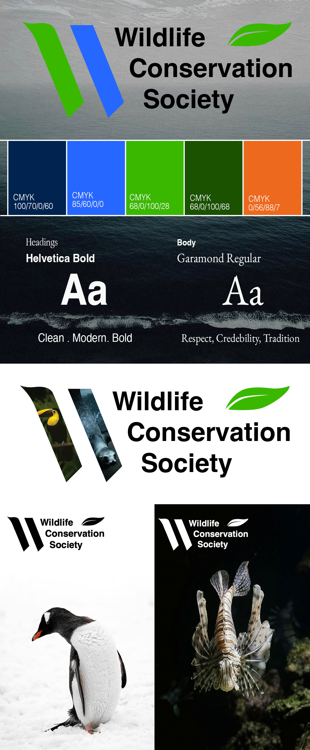

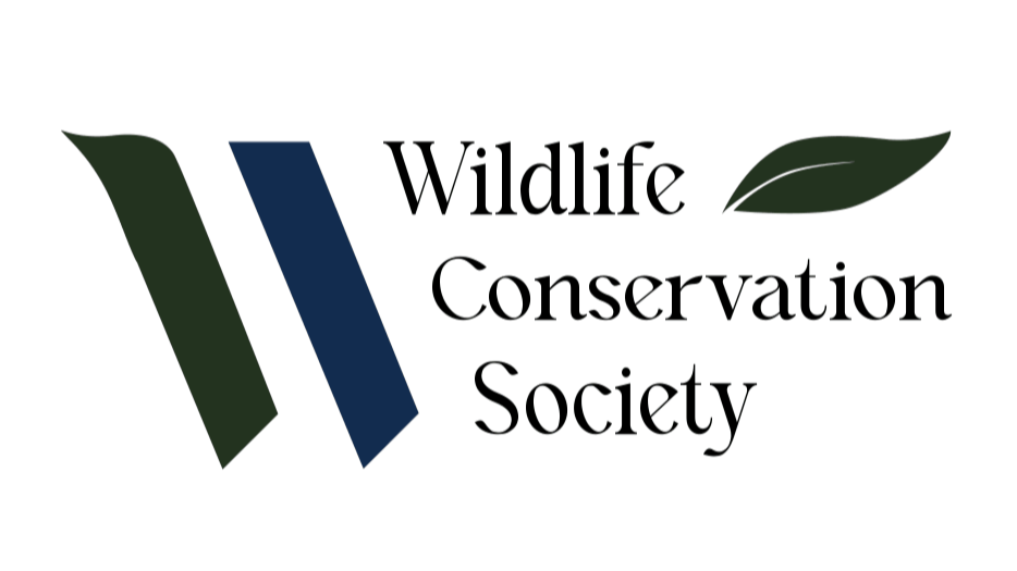
The logo features sharp, simple, minimalistic elements to modernize the brand, while subtle organic shapes like the curved leaf keep nature at the heart of the design. The bold colors (vibrant green and blue) bring energy and excitement, making WCS’s marketing feel more dynamic and fun instead of overly serious.
Green represents growth and the natural world, while blue symbolizes water and the global reach of conservation efforts. The angular geometric shapes create a sense of forward movement and progress, reflecting WCS’s action-driven approach to protecting wildlife rather than keeping it fully dull and academic.
NEW VISUAL IDENTITY
Meliilopez.com - ux/ui design and research
Let’s Work Together.

Meliidotl11@gmail.com